In this session, we will focus on the Brush tool. As digital artists, we need to really assess the tools that we have at our fingertips and decide when and where it is the right time to use and apply one to our work. There are far better programs out there to emulate a real brush – Photoshop and Painter just to name two. But even in the realm of vector design there comes a time to see if we can incorporate a more natural or organic feel.
The Brush tool should prove to be quite useful in your creative work, but as many find out, it’s not really like its sister in the pixel-based apps. We will learn to modify and push some of the boundaries of this tool in order to get it to where we need it to be.
SESSION INSIGHT
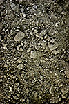
 When we hear the word, “texture,” most of us go right to an image of rough or gritty contrast. This is probably because culturally we tend to go to extremes when we hear terms like that. Most of the dialogue that takes place in our ordinary lives revolving around “texture” has to do with architecture and interior design – “popcorn ceiling,” or “rough hewn lumber.” Or else we think of food: “well, the flavor was good, but I can’t really handle the texture.” Sometimes we reference texture in a more physical way – “road rash,” or “like rubbing against a sidewalk.” When you take all these terms into consideration, and think about what they are really boiling down to, it’s organic or tactile sensation.
This is really what we are getting at when we bring the term “texture” into design and art. A reference to something in the real world. I love the word “organic.” It makes me think of something that I can touch and feel.
Yet here we are, in the digital age. Trapped in a computer that has buttons and a mouse, programs that do the thinking for us, buttons we can push and settings we can change. It is very hard to find the path back to an organic nature when all of this “convenience” is right there at our fingertips. This is where I hope to make you think. Think about how you can make your art feel real, or give the sensation of touch. It’s called Implied Texture. This can happen in layers with composite modes, masks, mattes, etc. Or it can happen in a simple brush stroke. But we also must know when it is not the right time to incorporate texture into our creative work.
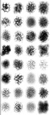
 Implied Texture in design usually means trying to emanate line on stone, canvas, wood or earth. But it can cover all kinds of material, including pattern, textiles, repetition, particles and so on. And so as we move into the realm of the brush, I encourage you to see how far you can push these concepts of texture, or reality. Illustrator has some pretty great brushes, and some really awful ones. Then there is a whole community out there that offers free brush presets to download and pull into your own design work. Look into it… and expect to blow a few hours, as it is a deep hole.
Now for most of you, you’ve been stubborn and have yet to make that commitment to acquiring an actual graphics tablet. This is where I jump in and say, “Are you really serious about being a digital artist?!!” And I would hope that the conversation stops there, and you visit the online merchant of your liking and hit the BUY NOW button. Still, you’ll have to wait for product fulfillment, shipping, setup and so on before you could ever put that life-changing device to use… so I’m just hoping you took my earlier recommendation and took care of this matter at the beginning of the semester.
Regardless, you’ve been drawing and creating images and designs, without much more than the assistance of the stylus (or that lame mouse or trackpad…) than just to create lines and shapes. But now we are in the domain of the brush. The brush allows us to redefine how our lines/paths will appear, giving a little more likeness to reality and fine art. This will involve some serious attention to brush settings and customization, but will surely pay off in the long run.
Here is a rather in-depth video from Wacom featuring some insight on how to make your tablet much more responsive, brush more personalized, and your designs much more beautiful.
Here is a little piece on getting more comfortable with your stylus and tablet, including some customization settings that can help benefit you as a digital artist.
This week we dive into the brush tool. Similar to the Pencil, the brush will bring ease to your strokes. But the brush can perform in ways much more like what we would hope for in our quest for organic interaction with our designs.
Topics: Paint Brush
• Brushes
Introduction to the Brush tool, its settings, options, etc.
• Custom Brushes
How to make and modify custom brushes in Illustrator.
• Blob Brush & Eraser
The Blob Brush gives us a little more ease when it comes to adding to existing shapes and forms. The Eraser comes in handy when you wish to eliminate part of your designs, but can be pretty tricky – it doesn’t quite perform the way you think it should.
There are no materials needed for this session’s tutorials. Instead, watch this digital speed painting by Toby Fox Art, that demonstrates some really great approaches to layering brush strokes in your still life work. This isn’t using Illustrator, but still, see if you can apply some of the same techniques in your exercise.