In this session we jump full-on into the realm of printing. We start with the tools and processes involved with setting ourselves up for print work in Illustrator, which really has amazing capabilities in this realm. In fact, you will probably find that most of your print/press work will only go this far, as the majority of your work will be for smaller-scale projects like business cards, posters, CD artwork, etc. Illustrator is really great at giving you control over precise document setup controls like bleeds, trim, overflow text, gutters, color separations and so on. And when we only need to produce a single “page” or only a few, this is where you will likely stay, and where most output facilities will demand of you.
However, going into greater projects such as pamphlets, calendars, magazines, books, programs, etc., you will need to up the ante a little bit and play with Illustrator’s big brother, InDesign. Here you have access to many more tools and controls for full-on publication. But of course, bigger programs mean bigger responsibilities and much more to learn and master. This is not the time for us to master this program, but more to just get enough introduction to it to be comfortable taking the next step. We will discover how great the two programs work together, and how to set up a multi-page print project and have it ready for output.
SESSION INSIGHT
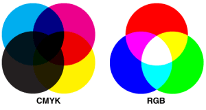
When it comes to color modes within our digital designs, we have several options but mostly work in RGB or CMYK color spaces. If you are this far in your studies with our school, you really should know what they both mean. But for a quick freshen-up, RGB stands for RED, GREEN and BLUE, and CMYK is referencing CYAN, MAGENTA, YELLOW and BLACK (or KEY.) RGB is a color space that is made up of the colors of light in the spectrum, and is the way we get colored images on our computer monitors and electronic/portable devices. With various combinations of the colors and their illuminated values, we get many other values that help produce beautiful images in millions of colors. CMYK is the color space for physical inks, mostly intended for printing in our world of design. It takes some serious technology and sometimes machinery to properly distribute the four colors in a way that has the same effect of full-color images and designs.

So, when do you use which, you ask? Try to remember this: RGB= digital delivery and digital publishing; CMYK= full 4-color process printing. If you are targeting screens (games, movies, web, phones, etc.) all files you work with and manage must be in the RGB color space. If you are sending a product to your desktop printer, or to the local copy shop, same thing: RGB. The printers and copiers have built-in software to manage the proper calculations to translate the RGB to CMYK. BUT, if you are creating a piece that will make its way to a full press facility, then it is critical that your files are set-up for CMYK color space, as well as any assets you are using in them, i.e. photos, graphics, logos, etc.
The Door Hanger project for this session will be prepared as if it will be a digitally published product from an inkjet or color copier, so all parts of the project must be in RGB color space, not to mention the proper print resolution of at least 300 ppi.
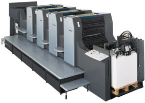
 Four color process printing is a system where a color image is separated into 4 different color values (called a color separation) by the use of filters and screens. This used to be done with photographic film on a graphic arts camera, but is usually done digitally with software now. The result is a color separation of 4 images that when transferred to printing plates and sequentially printed on a printing press with the colored inks cyan (blue), magenta (red), yellow and black (the k in cmyk), reproduces the original color image. Most of the entire spectrum or gamut of colors are reproduced with just the four process ink colors. The four color printing process is universally used in the graphic arts and commercial printing industry for the reproduction of color images and text.
- Uses same 4 standardized base colors all the time (Cyan, Magenta, Yellow and Black)
- Small dots of these colors are printed at different angles to create the printed image
- Most widely used and cost effective color system in commercial printing
- Significantly cheaper than toner based printing for larger quantity runs
Here is an interesting video showcasing the offset print process:
We have been hearing the phrase, “Print is dead” for some time now. Mostly due to the growing adoption of all things digital – we read so much more on our computers, phones and tablets these days. But is print really dead? Max Schumann thinks not. Please watch this short film.
Why Humans Prefer Print Books
By: Mark Hom, Posted on: January 4, 2016
Printed book sales are rising and eBook sales are slowing. Recent studies have shown that reading comprehension and retention are better with “old-style” printed books. I believe that there are several reasons why people interact better with paper books.
When you hold and read a book, you not only absorb…

