As we begin to advance into new areas, beyond just the pencil and pen stroke, we will find ourselves creating new objects and forms. This is where we start to see designs that become a bit more graphical in nature, and ultimately leads to simpler elements that can communicate just as well, if not better sometimes. Many things come into play here, like shape, scale, position, orientation and color. It is at this time when the digital artist really needs to get a grasp on some of the formalities of design and put in that little bit of extra effort to make sure that we are creating pieces that communicate clearly, cleanly and beautifully.
You will get a little exposure to more tools, but we will start to focus on some pretty important techniques as well. We will also get a grip on layers, which can get a little tricky, if not messy – if you don’t pay attention. Also a good time to remember to plan ahead. Be sure to play. In this field, play equals practice. And we all know that practice brings us perfection, but also understanding, comfort and speed.
SESSION INSIGHT
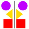
Balance is the equal distribution of visual weight in a design. Visual balance occurs around a vertical or horizontal axis; our brains usually feel the need for the visual weight to be equal on the two sides of the axis. Because we are bilateral beings, our sense of balance is innate. When elements are not balanced around an axis, the effect is disturbing and we feel discomfort.
 Symmetry is created by repeating the reverse of a design on the opposite side of an axis; each side, more or less, becomes the mirror image of the other. Symmetrical balance is considered formal, ordered, stable and quiet. It can also be boring. Symmetrical balance is most often seen in architecture and quick and dirty advertising.
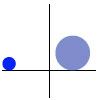
 Asymmetry achieves balance through contrast. Asymmetrical balance, involves different elements that have equal visual weight; the weight is equal but the elements are not identical. This can get pretty fun to explore.
Visual weight is influenced by several factors:
- Position – the further out an element is from the center, the heavier it will feel
- Size – larger feels heavier
- Texture – an element with more complex texture is heavier visually than one with a simple texture or no texture at all
- Isolation – an isolated element has more visual weight
- Value – darker feels heavier
- Quantity – multiple small objects can balance one larger object
- Orientation – a diagonal orientation carries more visual weight than a horizontal or vertical one
- Shape – elements that have more complex shapes feel heavier than those with simple shapes
- Color – the brighter and more intense its color, the heavier the element will feel
Asymmetrical balance tends to be more casual, interesting and dynamic than symmetrical balance.
Watch this interesting video on asymmetry and see if you can start to create your own language about how this can work visually.
In this video Illustrator, Greg Gunn. shares his process for generating ideas for his quirky Dog Walker illustrations. He’ll take you through his ideation process, where he starts, and how he uses the iPad Pro and Procreate to illustrate his concepts. He is using different apps than we are, but think about how to translate his process into one that would work with Illustrator.
Color truly is a make-or-break component in design. Too many times do we see work created by an artist who has not taken the time to “smell the roses,” or in this case, look at them. Everyday we take in so much color information, but so few of us really stop to digest and reflect on what works, what doesn’t and what makes you “feel.”
This next video will help you understand more about this critical element, but there is a lot more out there to explore and learn…
And in order to learn some great science and watch some excellent animation, Colm Kelleher has this short video that helps explain what color is.
• Fills
We now get into slightly more complex objects that have fills.
• Layers & Groups
Managing layers and objects within them.
• Shapes
Introduction to basic shapes.
• Alignment
Here we explore the alignment and distribution options with objects on the art board.
• Pathfinder
Pathfinder – one of the greatest tools/palettes in Illustrator. We learn how to manipulate objects with other objects. Cut hole, unite shapes, break apart, etc.

