We continue this next session with the same conversation as the last: Lots of cool buttons and pretty effects, but use them wisely and be the more valuable artist. You will be introduced to Illustrator’s effects menu and get a solid grasp on not only how it all works and how to manage them, but how a gentle touch is all you need sometimes, if any at all. With effects, appearance and styles you can really tap into some powerful stuff, and I guarantee these techniques will be forever in your workflow.
Up to this point in the class, the objects and forms that we have been creating have been relatively flat and presented in solid or gradient fills. That’s not a bad thing… not at all. As we have already seen, there is a great place for that kind of work, and we see it used effectively in so many different applications. There will be times, though, when the digital artist needs to bring more life into an illustration, or more complexity into a design. This is where meshes come in to play. A mesh will allow you to add many more shades and tones into your work, whether it be a portrait, still life, characters for a game or a logo. And like the other topics we have explored these last few weeks, we are getting into a little more complicated process. This means extra time, extra focus and plenty of experimentation.
SESSION INSIGHT
Everybody has heard the minimalist phrase “Less is More,” yet most of us get the chance to really understand what it means when it comes to our designs and artwork. There’s a bit of an incubation period for new designers, where all of the bells and whistles of these digital art programs are just so cool and fun to play with, that we forget that we should be focusing on the real essence of our images. You’ll get exposure to the various effects Illustrator has in it’s arsenal ,and probably get a little “click-happy.” Keep in mind that sometimes the most communicative images are clean and clear, simple and elegant. But of course, sometimes they are crazy and very active…
I think that Bill Post hits some good marks in this article from Just Creative. Please Read: (IF THE ARTICLE DOESN’T LOAD, GO HERE>> https://justcreative.com/2011/06/15/be-creative-but-please-dont-overdo-it/
Gradient Mesh is a grid-based painting technique in Illustrator that gives us advanced coloring of vector objects with smooth and malleable color transitions. Now that you’re familiar with the Pen tool and other path-drawing, selection, and color tools, you can use the Gradient Mesh feature to add realistic coloring, lighting, and three-dimensional characteristics to a flat vector object. Ultimately, gradient mesh can give you the effect of photo-realistic painting with all the benefits and freedom of resolution-independent vector artwork.
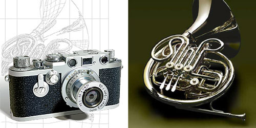
Look at these amazing detailed images by some of the best digital illustrators out there. You won’t believe that they aren’t photos or at least painted in Photoshop or Painter…
Takashi Morisaki
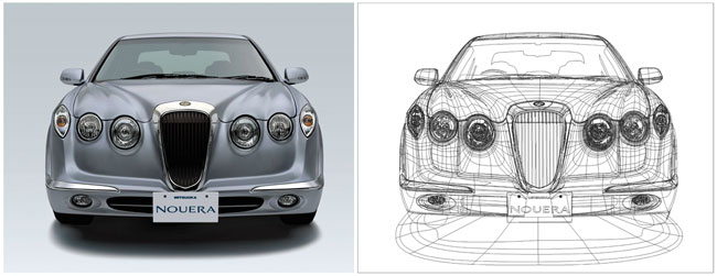
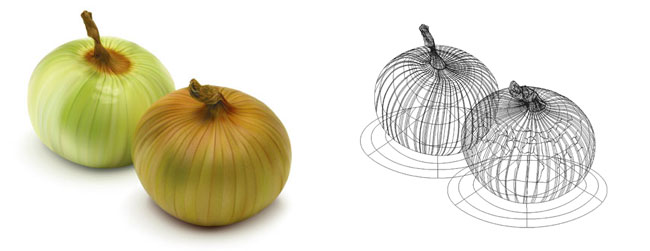
Ann Paidrick
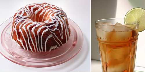
Wayne Forest
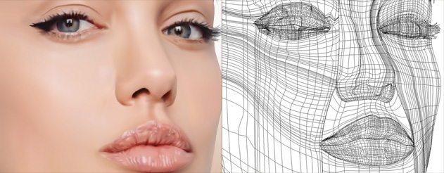
Yukio Miyamoto
Here is an impressive high-speed clip of the illustration of a flower that is super impressive. Take some time to watch how this comes to life.
Obviously, we are covering Effects and how to manage them within our objects, and how they work in the appearance panel. We also will cover the Gradient Mesh – the chance for you to get a little more detail into your objects.
Topics: Effects, Appearance, Graphic Styles & Gradient Mesh
• Effects
Shadows, Path tools, 3D, etc.
• Appearance
The hub of effects and more.
• Graphic Styles
Saving certain effects and appearances can be handy!
• Mesh Tool
Learn how we can create more elaborately colored objects with the gradient mesh.
