At this point, the student in this class should be feeling pretty comfortable with the tools and techniques that Illustrator has to offer. And it is at this point when we should explore the ways that Illustrator can play with its big brother, Photoshop. As a digital artist/designer moves forward with their work, it’s obvious that each application is going to provide certain assets that the other just can’t. Photoshop is the hero in (but not limited to) photo manipulation, digital painting, image composites and special effects. Illustrator, as we have been discovering this semester, is the big player in clean and efficient vector design that can be scaled infinitely without losing quality, logo and icon development, beautiful patterns and more. We will see this week that Illustrator is really the go-to for typography, simple layout and publishing pieces.
When we learn how to use these two together, we take our work up a serious step. And it’s not just Photoshop that Illustrator works well with. We will look at exporting into Adobe After Effects and working with InDesign, too. But don’t let that stop you from working with Flash or other software out that that you might be using, and not even limited to Adobe products.
Integration really is where it’s at when it comes to digital design. The more you realize when you should use what, the better your work will perform, the better you will work with other designers, and you will find improvements in efficiency and professional confidence.
And oh yeah… we will be looking at the Type tool in detail this week, too. That should help with our assignment, and get us ready for moving into InDesign.
SESSION INSIGHT
 We haven’t really delved into the world of type yet, for various reasons, but it’s obviously something we can’t avoid. Typography is a very HUGE subject of study, which many young designers don’t fully understand. Many of us think if we know how to spell, that’s most of the work in typography. Nope. Type forms come from deep in our blood as a form of symbol making. So much more than the words can be communicated in subtle, hidden ways from scale, form, color and arrangement.
As with the section on logos, I won’t be able to teach you all you need to know in a week. There once was a whole class that we offered on typography, but due to budgets, etc. we had to pull it. But I can say with some confidence that it looks like we might be able to put it back on the books relatively soon. Let’s hope, because it is a critical toolset for any and all designers. I can, however, get you started on some very basic principles and techniques that will get you into a more confident space as we push into work that is more text-driven.
My tutorials will help with getting your hands on the tools, but I found some very valuable reading for you that you need to look at.
Joshua Johnson over at Design Shack has written up 8 Rules for Creating Effective Typography, and covers some of the language and concepts that a designer must be fluent with.
Read it here
Colin at Photoshop Cafe has published his 10 Principles for Better Type Design, and is a great compliment to what Joshua covers. Please look this over, before and after you start playing with type.
Read it here
And you will learn to love to visit this site more and more. I Love Typography is a great source for knowledge, inspiration and community.
Visit Site
We cover the importance of getting used to working between Illustrator and Photoshop this session, but there is even a greater idea going on here. It’s about doing your best to master your domain. Not like in Seinfeld, but right here as a digital artist. The more you know, the more you try, the more you fail and the more you push yourself, the better you will become able to communicate and express yourself in the best and most efficient way. This can mean within the computer and all its tools, and it can mean within yourself – creatively and emotionally.
Have a quick read about The Benefits of Mastering Your Craft, by James Clear, and think about your own connections to what he is saying. This goes beyond button-pushing and menu clicking, and I feel it’s a necessary place to put our minds on occasion to help keep us focused and pushing for more out of our work. (IF THE ARTICLE DOESN’T LOAD, GO HERE>> https://www.accidentalcreative.com/growth/pursuit-of-mastery/
Failure is a critical component to successful creative work. Chase Jarvis interviews Seth Godin on this concept, and is quite insightful.
So much of the work we do digitally is right here with these machines – the big ones. Your desktop, laptop, etc. And for the most part, that’s where we feel we need to stay. If you need to get an illustration from its paper/pen form into a project, we think SCANNER! Sometimes maybe we think we could shoot it with a camera, then transfer it over to the computer via flash disk or USB. But that world is changing real fast. With new tools and software built exclusively for smart phones and tablets, we can make some of these techniques and transactions happen much more effortlessly and efficiently.
All you really need to do is look around on the App store for your platform in categories for digital design, photography, typography, etc. and you will find SO many options for you to help you with your work flow. Here are a few examples:

 What the Font is an app that allows you to take a photo of any text that you see (within reason…) and identify the letter forms. The app will then upload your photo to its server and process it, analyzing it against its font database, then provide you with actual fonts that it believes fits that form the best. This can be a real life-saver when in a pinch, trying to find out what font someone used in an actual design or setting.
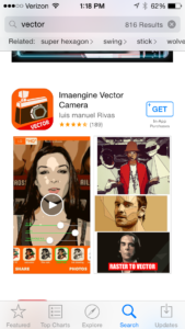
Here is an app that allows you to convert raster images into vector, very similar to how Image Trace works in Illustrator.
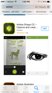
And this one is especially cool. Adobe has a whole fleet of mobile apps that you could find useful. Shape allows you to have a little more control over your raster-vector transformations, and could be super useful in getting your illustrations or hand-made type into it’s mother program, Illustrator.
Go look around and see what else you might find useful in your day-to-day digital art work.
Here is a demo of Vectornator Pro. Pretty cool stuff!


